Track Cover
Barbash.Design Logo

Ognomy – Streamlining Patient Registration & Strengthening Brand Presence

Product Design

UX Design

Cross-platform design

Visual Design

figma-icon

Figma

Adobe Illustrator Icon

Adobe Illustrator​

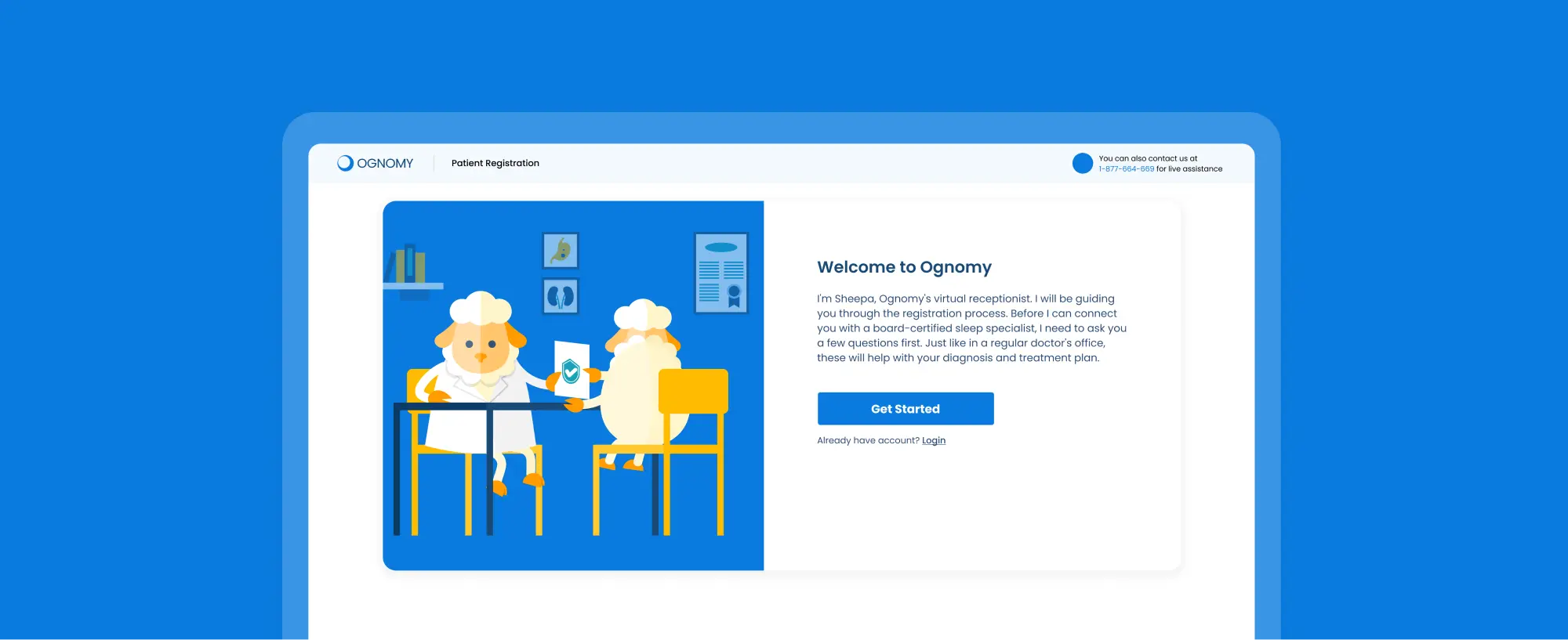
Ognomy is a telemedicine platform that makes sleep apnea diagnosis and treatment more accessible. But while the medical side was strong, the user experience wasn’t keeping up.

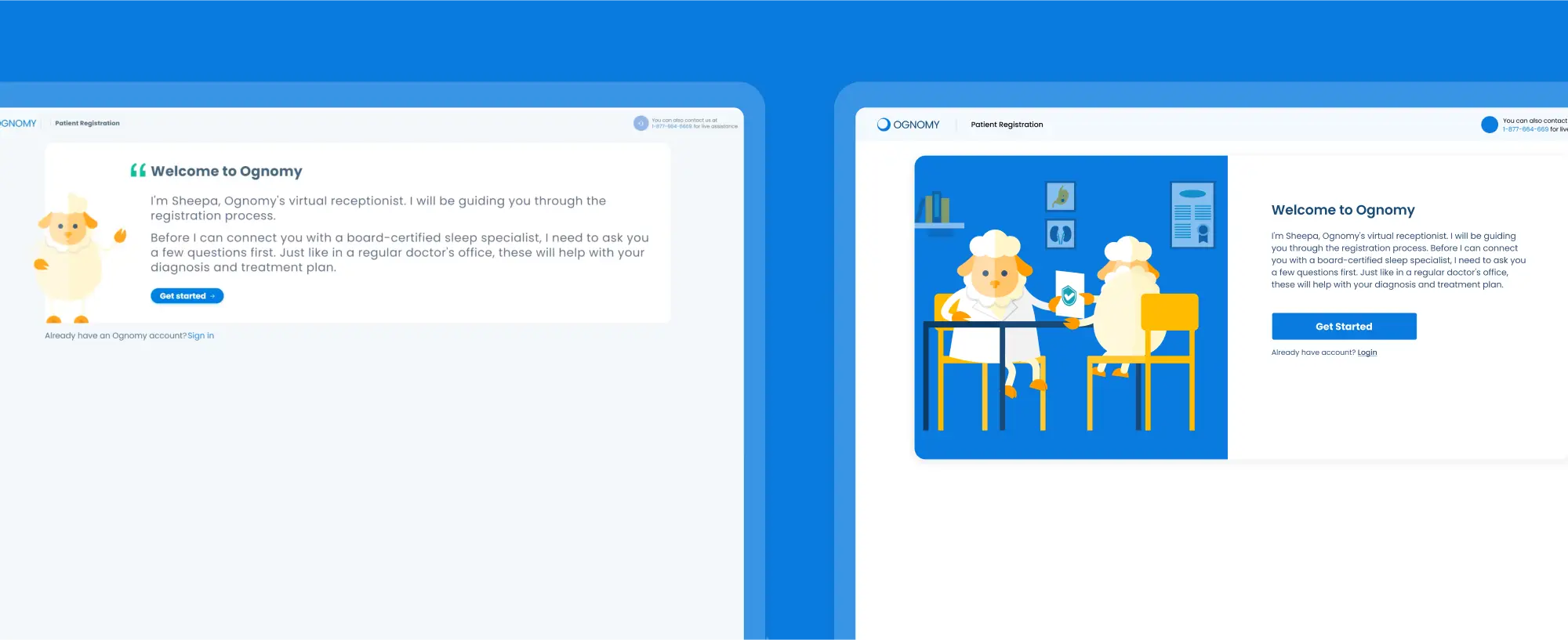
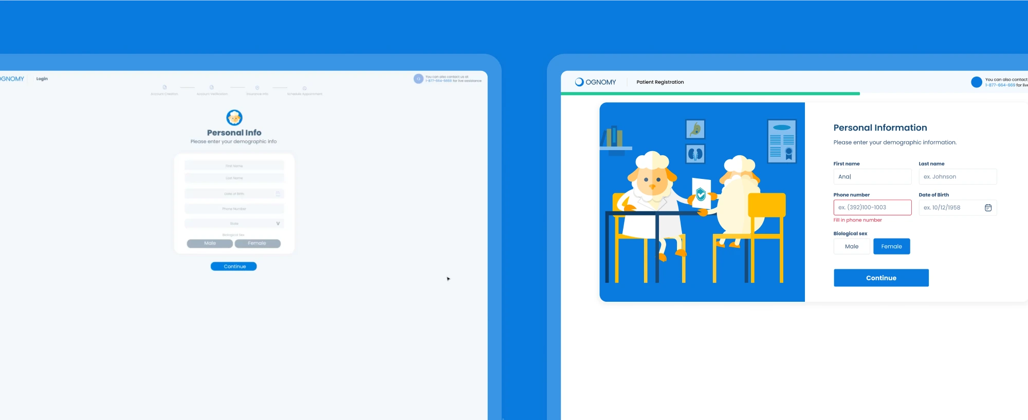
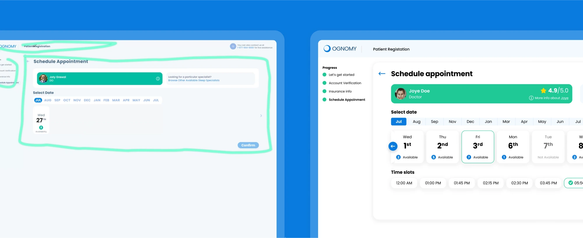
Patients struggled with a clunky, outdated registration flow. The process felt long, confusing, and unintuitive—not ideal for a healthcare platform where trust and ease of use are critical.

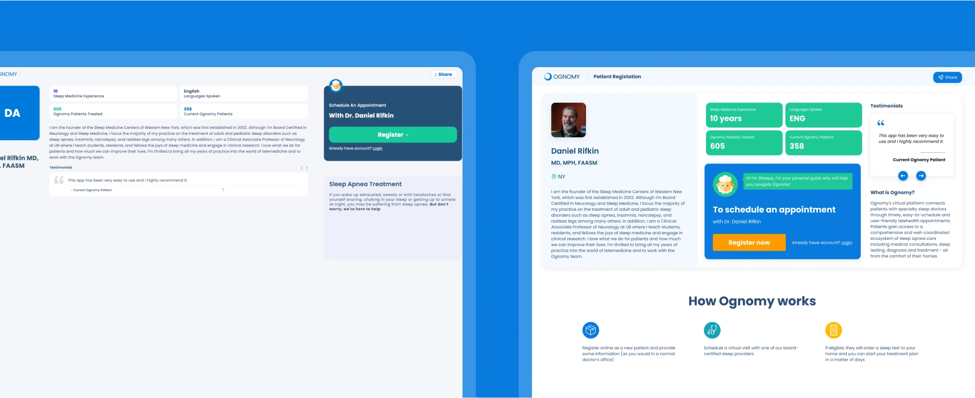
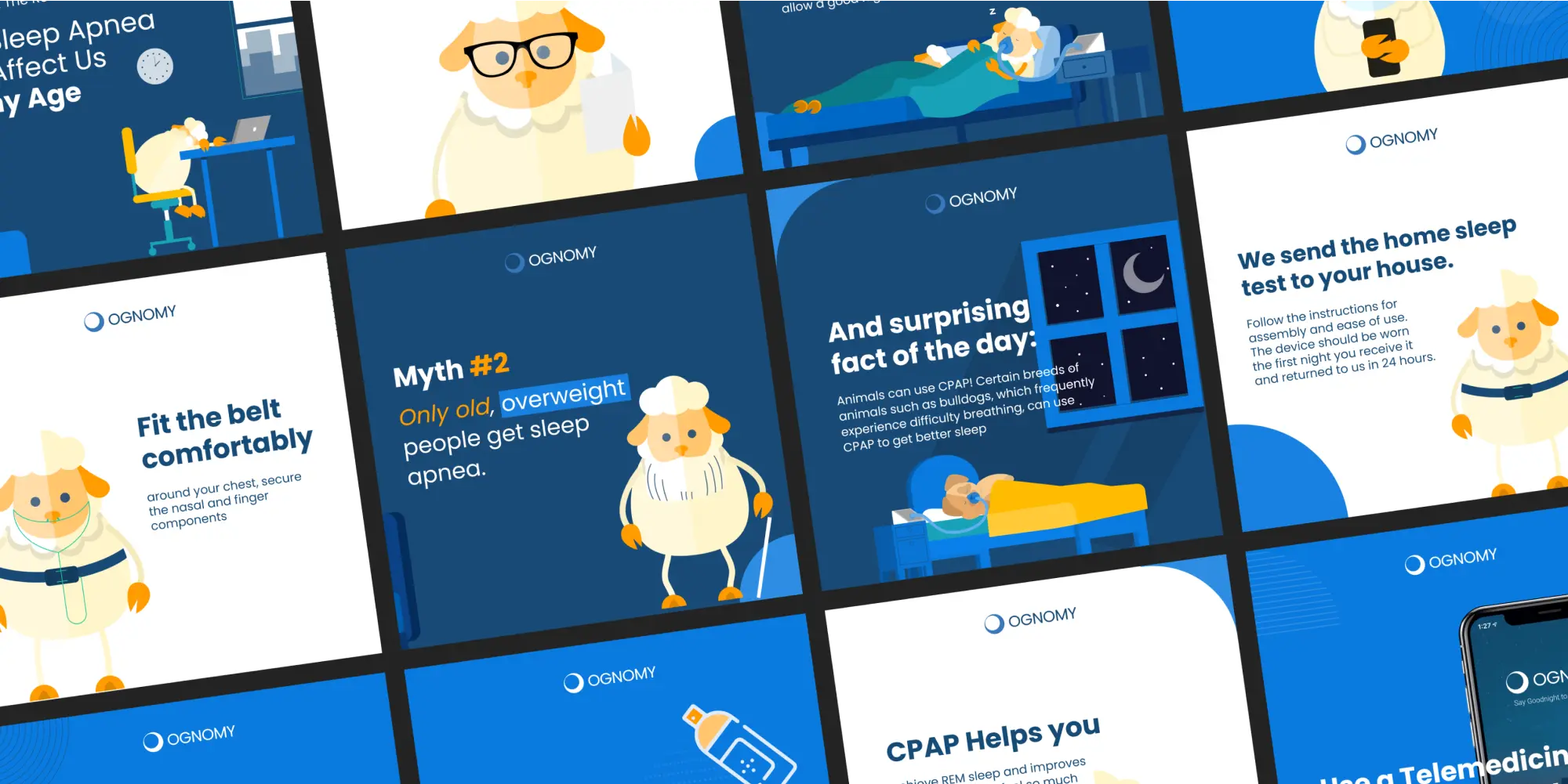
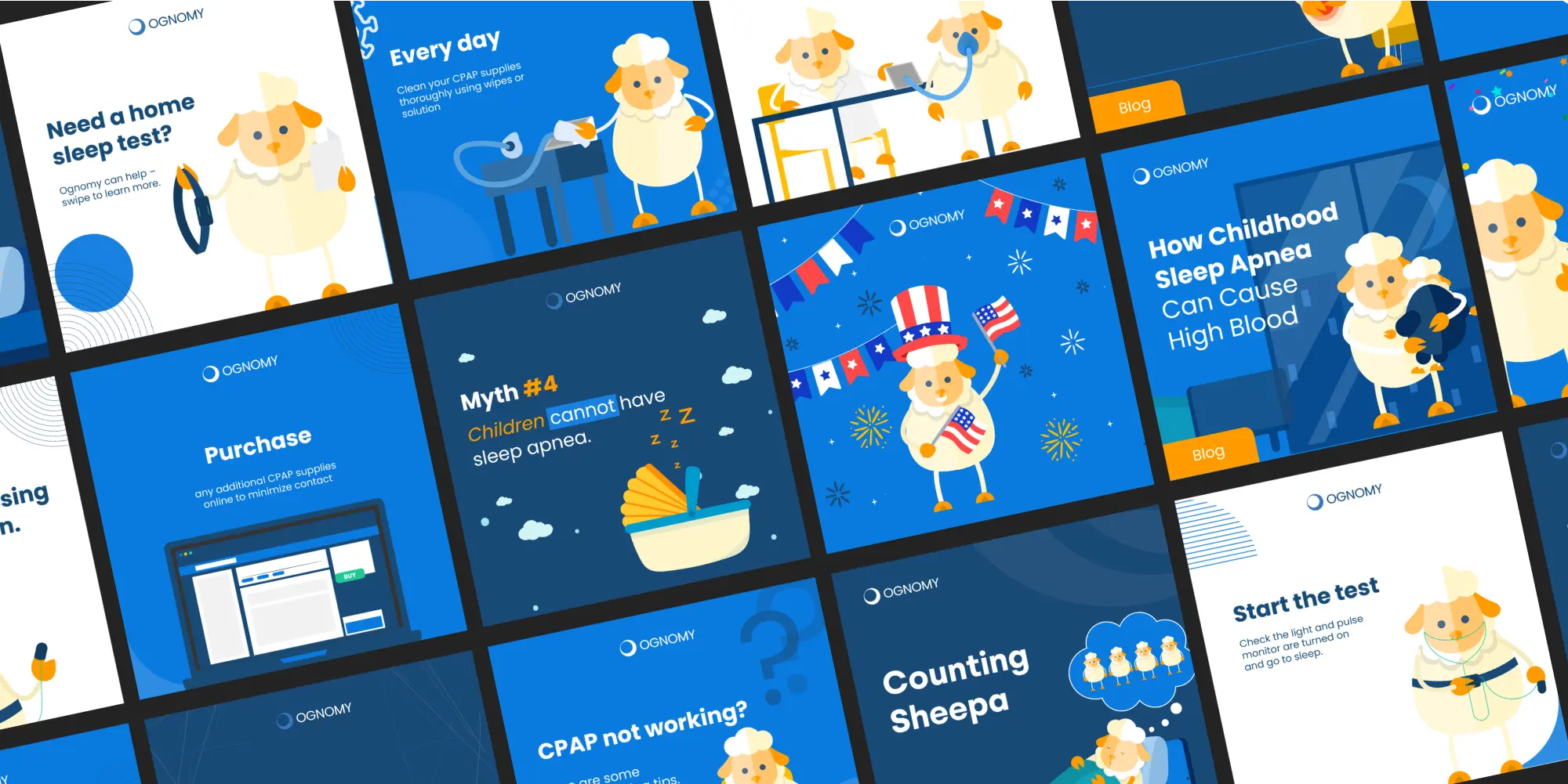
Beyond that, Ognomy’s brand presence lacked visual consistency. Their social media didn’t reflect a professional, unified image, making it harder to establish credibility and engage with their audience.

📈 Smooth patient registration

The new UX/UI made sign-ups faster and more intuitive, removing friction that could have caused potential drop-offs.

🎨 A unified brand presence

Ognomy’s visual identity became stronger, ensuring consistency across the product and social platforms. Patients now interacted with a cohesive, professional, and recognizable healthcare service.

🐑 Sheepa as a true brand asset

More than just a mascot, Sheepa was woven into the brand experience, making Ognomy’s presence more engaging, friendly, and human.

🔍 The Challenge: Fixing Friction Points

A smooth registration process is critical in healthcare—patients expect simplicity, clarity, and efficiency.

At Ognomy, the registration flow worked, but it wasn’t as intuitive as it could be. The process had a few extra steps, some UI inconsistencies, and lacked clear visual guidance, making it slightly harder for patients to complete smoothly.

Ognomy already had a foundation—its brand existed, and Sheepa was part of it—but the execution wasn’t fully cohesive. My goal was to take what was there and scale it into a seamless experience, both in the product and in communication.

💡 The Solution: UX & Visual Consistency

To improve Ognomy’s patient registration and brand consistency, I focused on three key areas:


1️⃣ Streamlining the Registration Flow


🔍 Audit & UX fixes: I analyzed the existing process and identified lack of UX. Patients needed clearer guidance, so I restructured the flow for a more intuitive experience.

Patient Registration: Old vs New UI

🎨 UI improvements: The new design introduced stronger visual hierarchy, guiding users effortlessly through registration. Forms were simplified, action buttons became more prominent, and unnecessary distractions were removed.

Patient Registration: Old vs New UI
Patient Registration: Provider History Screen.

✅ The result: A faster, frictionless registration process that felt intuitive and effortless.


2️⃣ Unifying the Visual Experience


Ognomy’s identity wasn’t built from scratch—it already had a foundation, but it lacked a structured, scalable visual system. My role was to refine and expand what was already there, ensuring the brand felt cohesive across UI, social media, and marketing materials.

 
Ognomy: Brand/Social Design Strategy - Examples

A key part of this was Sheepa, a recognizable character that was part of Ognomy’s world but wasn’t fully integrated into the experience. By weaving it more naturally into the brand’s ecosystem, I made sure it felt like an intentional, engaging element rather than just a mascot.

Ognomy: Brand/Social Design Strategy - Examples

In the end, Ognomy’s visual presence became stronger, more unified, and scalable, creating a consistent look and feel across every touchpoint.

Achievements & Takeaways

Ognomy isn’t just another healthtech startup—they’re building something genuinely impactful. Their mission to make sleep apnea diagnosis more accessible resonated with me, and being part of shaping that experience was both exciting and meaningful.

And of course, Sheepa is a tiny ball of joy. 🐑✨ Making the brand feel more alive through design was a special kind of fun.

More than just a UX/UI project, this was about helping a startup find its visual voice, create trust, and grow into something bigger. I truly hope they succeed—because they deserve to.