
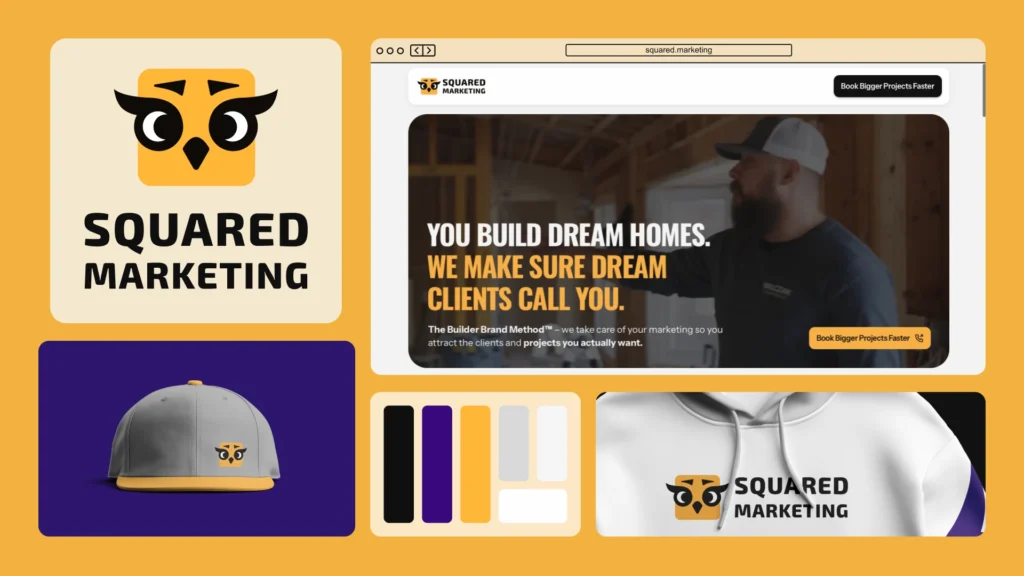
from A-Squared Media to SQUARED MARKETING 🚀
Art Director
Brand Design
Website Design
UI Design

Figma

Adobe Illustrator

Framer

Jitter

HotJiar
Little intro: Squared Marketing is a Boston-based creative agency that helps real estate, construction, and architecture brands stand out through powerful visuals and strategic marketing.
Formerly known as A Squared Media, they’ve grown from a production-focused studio into a full-scale marketing partner — blending video, design, and messaging to help companies connect with their audiences and sell with clarity.
I was initially meant to refresh their website, but as we started talking, I realised, that we can do way more than that, knowing that massive business relaunch is coming. So I challenged myself with rebranding, but challenged is a strong word, when it comes to Squared Marketing founders. They gave me freedom, with the only ask in mind – please, somehow leave the owl… 🦉
So I entered into my creative paradigm to find SM essence.
Let me show you how the initial logo looked like and the my way of thinking, that’s an important part.
I don’t want you to get subjective, but in my opinion, they had a lovely logo for a bookstore, Harry Potter scene or else, not the marketing. Because of its details the logo got lost in small sizes, and that’s not the way you want to look in social media as a business. 🤓

Let’s see in small size I was talking about previously:

A rebrand where the owl survived! Now, I needed to shape it just for Squared Marketing guys.
Easter egg 🐣: the owl’s lashes represent quote marks, because this owl doesn’t just see — she speaks, as marketing does.
So for me, it was the key to find the way to show the expertise, experience, and passion. The next step we took to find the right owl’s look, Squared wanted to see her eyes, even though, it was a tiny tricky to implement. I was keeping in mind the minimalistic approach I wanted to maintain. It was crucial for small-size mark in use, so it won’t get mushy.

At some point, the heat of which one to pick got wiiiild! So as a creative, I love finding the ways for a perfect match. Thus, I built a “Choose your owl” prototype, where each founder could mix & match eyes, brows, beaks, lashes — until we found the one that felt exactly right. A visual hybrid, where some elements came from one founder, others from the other, and a few shared — now they each see themselves in it. How cool is that?
Of course, the logo mark cannot stay there all alone, so I’ve came up with the perfect color palette emphasising the business and the target audience it speaks to.

As the last piece of trio, fonts come in, I wanted them to be prominent, corresponding, bold and soft at the same time.

Next step: designing & launching the website
Alright! We started with the brand — and honestly, that part was a blast. I helped Squared Marketing refresh their visual identity in a way that finally felt like them: bold, approachable, and ready to stand out.
Once the new vibe was in place, designing the website just sailed! The whole process was super collaborative — I worked closely with their copywriter, adapted the structure, simplified the flow, and made sure the final result worked beautifully on the web. Since we’re on the same page, I marked, that the website style itself has to be a tiny official business-like, yet converting and with a soul. Bold and approachable.
Oh, and we did all this in just one week. Tight deadlines, but the energy was so good.
When we launched, the analytics skyrocketed! And their network loved it. Check out the insta 🙂 Comments, likes, shares — the new look resonated immediately. The site became a core piece of how they present themselves now.

The client’s feedback?
“Hey Ana, thank you so much for working on this. Here’s my feedback. Spoiler alert: It’s great!”
And to keep building and growing, I’ve added the HotJar tracks, as well as google analytics, we’ve packed it all to be on top of things 🙂

To summarise, what I did:
✅ Full visual rebrand: colors, typography, visual tone
✅ Responsive website design & build in Framer
✅ Content adjustments based on my knowledge of the web
✅ Smooth, modern UI components
✅ Collaborative work with the copywriter and team
🧨 What I loved most
Cliché, but — the entire process was pure creative chemistry.
One of those rare moments where design, strategy, and good vibes just click. I got to help a team I genuinely admire show up as their best selves — and that’s exactly the kind of work I want to keep doing.
We laughed, brainstormed, vibed. I got tons of Looms with *“OMG”*s and *“WOOOW”*s (which still makes me flutter) — and by the end, I signed off something that truly reflects who they are and where they’re going.
They trusted me fully — and I gave back my all: a visual system that feels like them. Strategic, flexible, and full of personality — just like the team.
There are more awesome projects ahead — this is only the beginning of Squared Marketing. 😎
Want a similarly bold, funky, yet cute’n’cozy transformation? Ping me!